How To Use Data Viz in Google Sheets
As a data journalist, I use spreadsheets often.
During my weekly spreadsheet worship, I found an interesting post on Medium - written by Hjalmar Gislason - about a brief history of the data tables, and it got me thinking about the general idea of visual organization.
I can't cover the entirety of everything when it comes to spreadsheets and data tables and why they work; that's way too much reading.
But what I can do is list some inconsequential thoughts about data tables, from the perspective of a professional. So here they are.
There should be more spreadsheet style guides
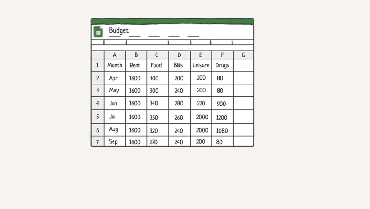
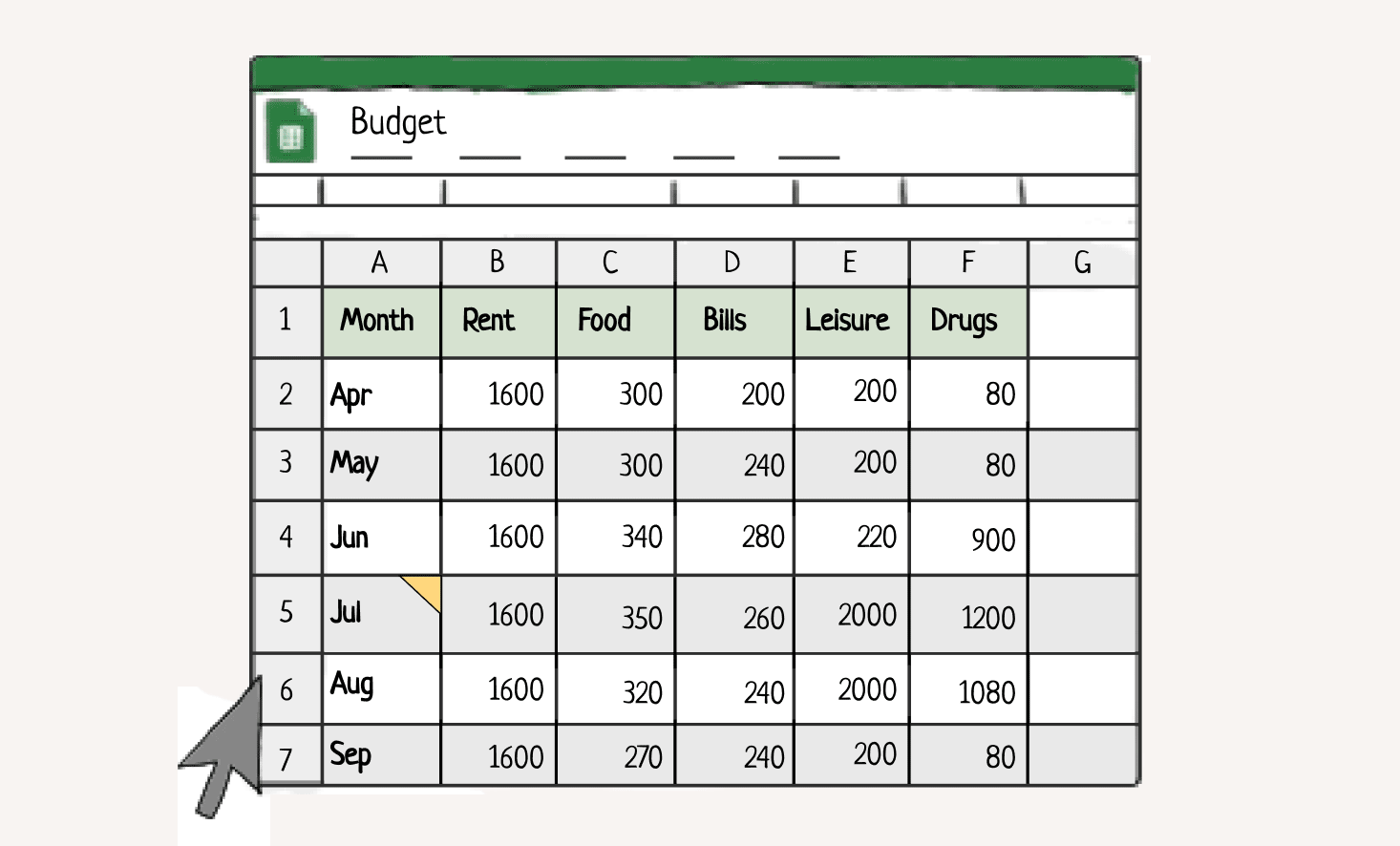
This was something I would put a lot of time into, actually. Numbers are dense, and I felt always felt compulsion to organize my spreadsheets in a way that maximized skim-ability.
And how did I do that? Style guides.
The main idea for a lot of design in general is visual hierarchy, so I created a hierarchy of information in my spreadsheets:
- bolding column headers
- adjusting column sizes
- shading alternate rows/adding colors to help improve readability
- aligning text
This isn't always 100% fool-proof, but whatever, you get the idea.
Spreadsheets were my number one collaborative tool
This one kind of surprised me, but it shouldn't have.
Back when I had a day job at the Guardian, spreadsheets were used for nearly every story I was involved with.
When I left The Guardian and started taking contract jobs, a lot of links, staff directories, etc were stored in a Google Sheet somewhere, as opposed to a Google Doc or a Notion page.
If I had to guess, the ability for everyone involved with a project to see and touch a piece of data was too big of an incentive not to use Google Sheets. And since it's Google, it's 'trustworthy.'
I don't mind using Google. I'm sure there are a lot of ethical questions that come to mind for some readers, but any software that allows for comments is a good software to me.