Coding a School of Fish (P5.js Tutorial)

I’m a data visualization designer, so the goal of my work is to make information legible and, hopefully, pretty.
As I approach my 30s, I am now shifting from green-eyed practitioner to seasoned vet, and one of the duties of a seasoned vet is to explore frontiers. Thus, comes the title and topic of this blog; exploring the more subjective side of science communication by showing data viz in more artistic mediums.
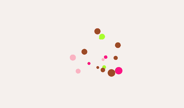
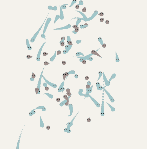
The above is a gif of about 100 fish subspecies; the ones in blue are biologically sustainable, while the ones in red are overexploited. the ratio is about 65:35.
But could you get that from this gif? Would it be clearer if there was a title and a subhead and a key? Well, let’s dive in.
A quick note on why
Why art as a a medium for data visualization?
The elevator pitch is that current data viz, while effective, lacks imagination, and humanity can use a little more beauty and wonder in our communication.
I look to myself as an example. Even I glaze over graphs if I’m reading something dull…they just lack a compellingness about them that can be found in work like Mona Chalabi or Giorgia Lupi (I’m a fanboy of both).
Now, don’t get me wrong, not every graph is bad, and quite a lot of this is my own lack of an attention span. But if we’re not designing for the people with low attention spans, who are we designing for?
What is P5.js?
P5.js dubs itself the ‘coding framework for artists’ (I think I read that somewhere). Here’s a link to the live fish code if you want to follow along.
First things first, if you don’t know basic HTML, CSS, and Javascript, please read up on those first. This blog is supposed to be a quick read, so I can’t dive into all the specifics.
Second, if you don’t know Java or Object-Oriented Programming, please read up on that too.
The short way I would described P5.js is it is an object oriented language, which means that you think of different ‘classes’ or ‘type of thing’ on the screen. In the example above, for instance, I create a ‘class’ for fish. But there are two types of fish - dead or alive - so, that variation needs to be accounted for.
Let’s see the code
Now, every class has properties (what color is this class, what shape is it, etc). And, for this specific data visualization, I created a class for the fish (I called it Particle). The plan was to draw a number of these Particle class objects, and change their physical properties to describe what data points they are representing.

Most of the time, randomization was applied when I created these variables, just to give the visualizations some kind of generative-ness to it. I think allowing for natural occurrences adds to the subjectivity/humanity of the communication.
Where does data come into play?
Of course, it’s important to have variables that are easily interchangeable. In my code, I usually list these at the top. Notice how I have both a count for how many particles there are (PARTICLE_COUNT) and how many healthy particles there are (HEALTHY_PARTICLE_COUNT).
The idea I had is that I would draw 100 Particle classes. I would then draw X% of them using properties A, and I would draw Y% of them using properties B. Technically, this can serve as some sort of pie graph or area chart while still having subtle (or not so subtle) movement. Simple, yea?

This data, for now, has to be quite rudimentary, just because it still needs to be accurate and understandable before we can bring in beauty.
Combining the code
We now have the data linked to our variables, and we have the code needed to draw what is required. Now the only thing left is to combine the two.
When setting up P5js calculations, there always involves an initial setup process. Below, I take the static variables I created at the top of the code file, and I create the Particle classes based off the data there. EG, I am making 100 particles, 65 of which will have the isHealthy property set to ‘high’.

The result is the animation you see above; 100 fish, 65 which are colored in the way I deemed appropriate for the ‘Healthy’ class. Here it is below, in video format.
Is that all there is to the code?
Not quite…the code above merely creates the fish. There’s a lot more to the code.
Because this is an animation, I needed to include movement somehow, and because I wanted this to have a tint of generative realism, I used math to come up random locations at every frame.
I also add some effects, like crossed out eyes for the fish, and different z layers so it seems that the fish are intermingled.
The full code can be found here, but the premise is based on the idea of calling update() every X seconds, and this update() call allows the movement to appear so fluid.

What’s next?
I’ve created a handful of these artistic visualizations, and plan to write and record more tutorials about them, just so other people can do what I’ve done'; copy a base from others, and expand.
This one was relatively short, and that was on purpose.
Thanks for reading Gourmet Graphs! Subscribe for free to receive new posts and support my work.